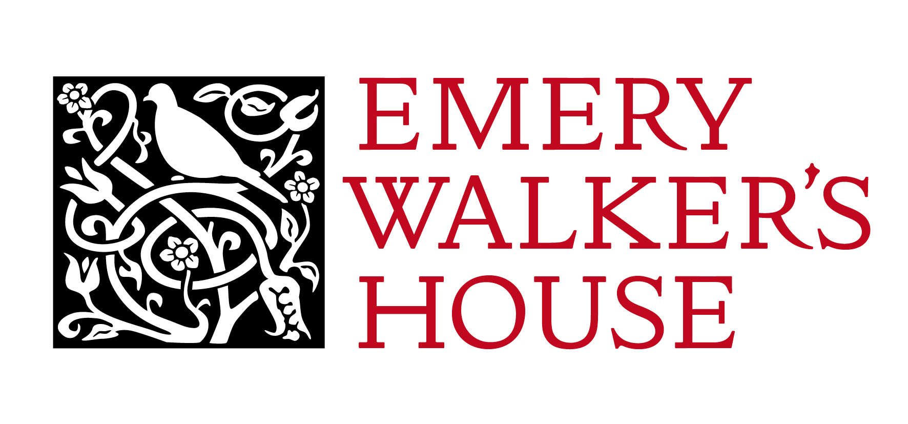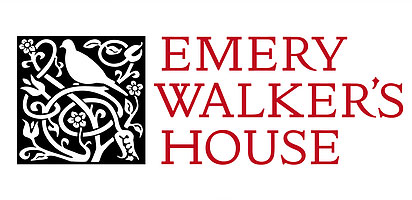
We are thrilled with our fantastic new logo for Emery Walker’s House (see above). We wanted it to be visually beautiful and encapsulate the many themes of Emery Walker’s House, such as the Arts & Crafts aesthetic and Walker’s work as a typographer. In this blog the designer, Simon Loxley, takes us through the process of creating the logo, working with The Emery Walker Trust to find the perfect design.
Although I tried a couple of early versions without it, it seemed an obvious choice, and a missed opportunity otherwise, to use the Doves type for the logo. That was the easy part. But what to use for an accompanying image or graphic? In stark contrast to Morris’ books, one of the distinguishing features of the Doves Press’ output was the absence of illustrations, and very sparing embellishment. One of the Press’ watermarks, featuring two doves, was a starting point, and simplifying it to just one dove to represent Walker without his ‘challenging’ partner, seemed another route to explore. In the first batch of ideas I had one that I thought was a potential winner, plus another I felt had possibilities, but both failed to stir any similar emotions among the Trustees. That’s the way it goes sometimes. There was a desire to express the Arts & Crafts nature of the House, which structurally however, is Georgian. That ruled out any architectural features. Alternatives were tried with Morris furniture from the House. The contenders Trustees chair Michael Hall asked for, prior to the deciding meeting, were versions using the original doves of the watermark, and another featuring a Philip Webb-designed chair.
But I still felt there was something more to be had, if I could just find it. The shape of the doves in the watermark was a little undefined, so I created a new version, which I then tried out in another option. By chance I had been in Oxford in the summer, and had wandered into Blackwell’s, who had a sale in their rare books section of Morrisiana from the John J. Walsdorf Collection. I took a catalogue and looking at it in the pub, saw a couple of desirable items at surprisingly low prices. I raced back, but both were long gone. Reluctant to leave empty-handed, I bought a couple of leaves of Kelmscott books, one of which I framed and hung on the wall next to my desk (page 924 from The Golden Legend, if you want to know exactly). I decided to scan, enlarge and then redraw its decorated initial ‘I’ and see where that might take me. As the Kelmscott Press arguably would never have happened without Walker, it seemed legitimate territory to draw upon for the logo. Once I had taken out the initial letter from the design though, there was a space. On an impulse I turned my redrawn dove to white and dropped it in. And there it was. I played around with the size of the dove and redrew a little of the foliage, and it seemed to me that this could be the answer that had something for everyone. It strongly said Arts and Crafts, which represented the style of the house’s interior, while combining in one image references to the two great presses in which Walker was a pivotal figure – the Kelmscott Press and the Doves Press. And to my eye it had presence, and vitally, beauty. Michael submitted the design to the Trustees along with the other contenders, and I was extremely pleased that it was the one chosen.
Simon Loxley is a graphic designer and writer on design, typography and design history and you can see more of his work via his website: www.simonloxley.com
